Mary Bergeson
Let's work together
Senior designer turning brand strategy into marketing that people actually see.
I've worked with


HEY THERE, I'M MARY!
Who I am
WHAT I DO
A FEW MORE THINGS
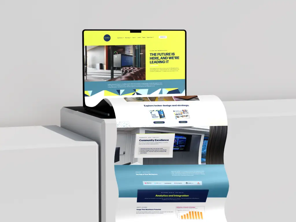
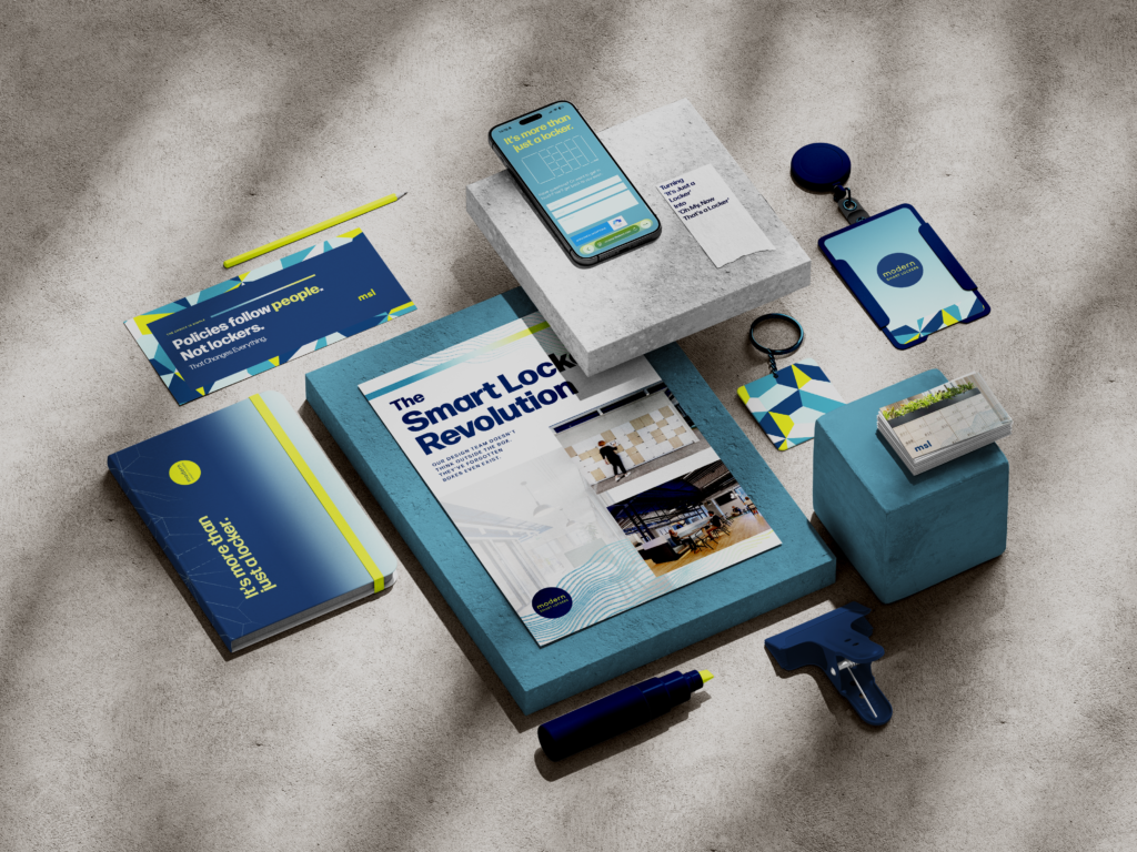
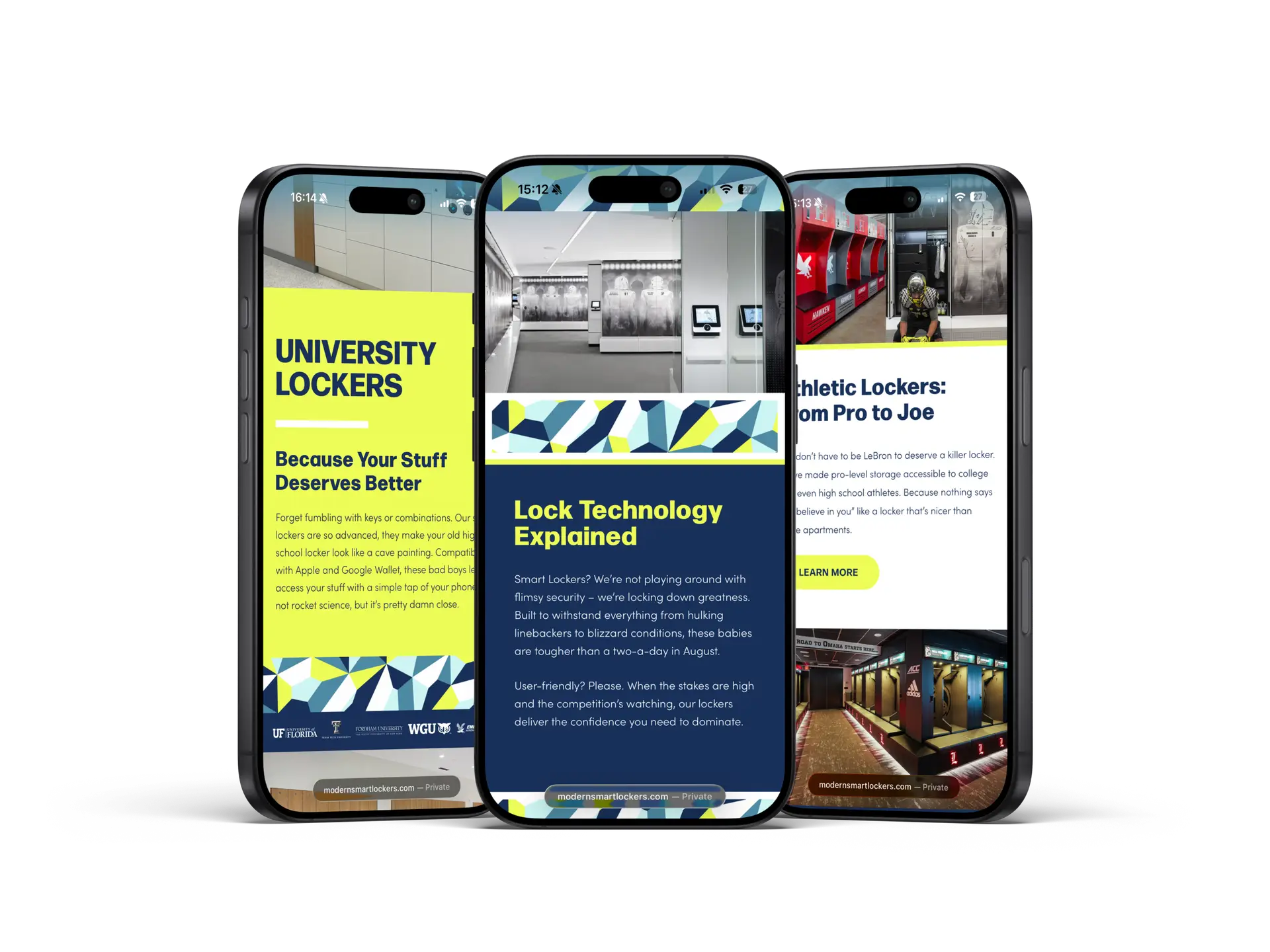
Modern Smart Lockers
EXPAND
MOST DESIGNS CONFIDENTAL
MODERN SMART LOCKERS
Client brands
ROLE
SERVICE
BRAND SYSTEM MANAGEMENT NOTION HUB
SET UP
OUTCOME
PROJECT DETAILS
RESULTS
Metro by T-Mobile
EXPAND
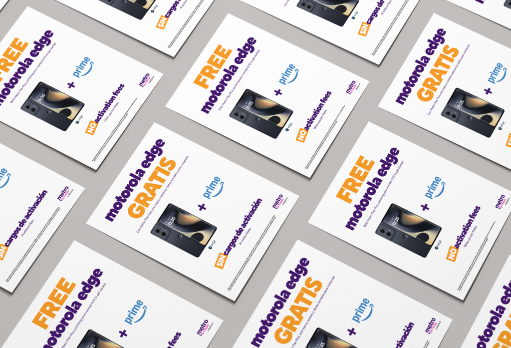
metro by t-mobile
Client brands
agency
SERVICE
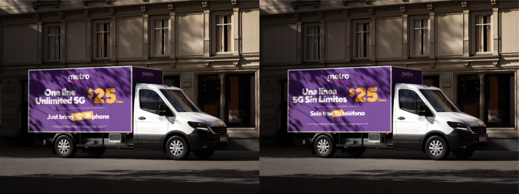
PROJECT DETAILS
RESULTS
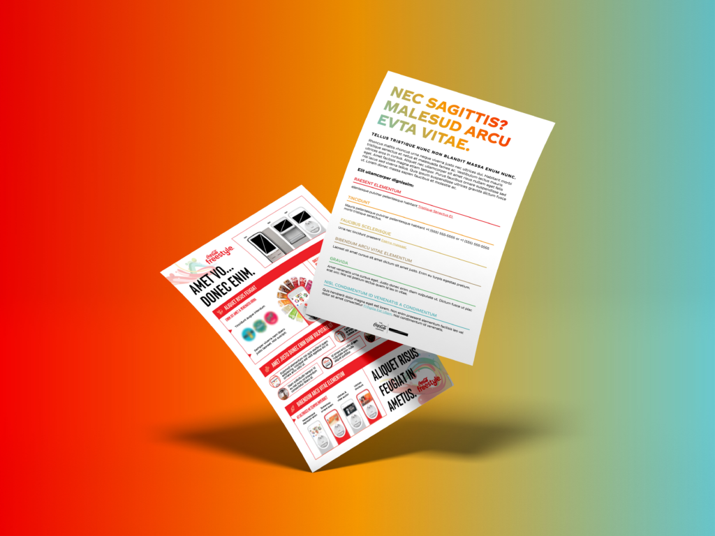
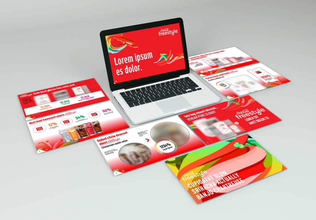
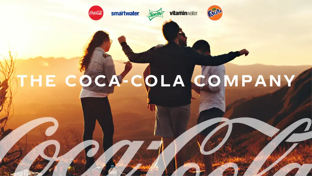
The Coca-Cola Company
EXPAND
MOST DESIGNS CONFIDENTAL
The
Coca-Cola
Company
Client brands
agency
SERVICE
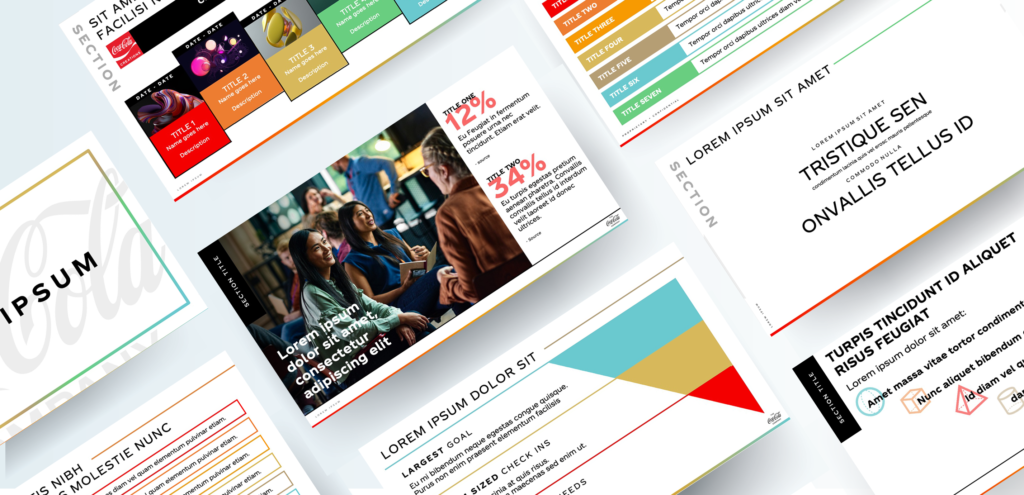
PROJECT DETAILS
RESULTS
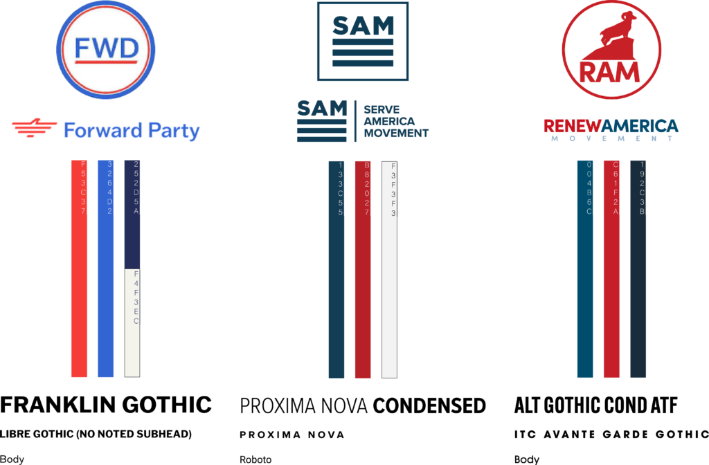
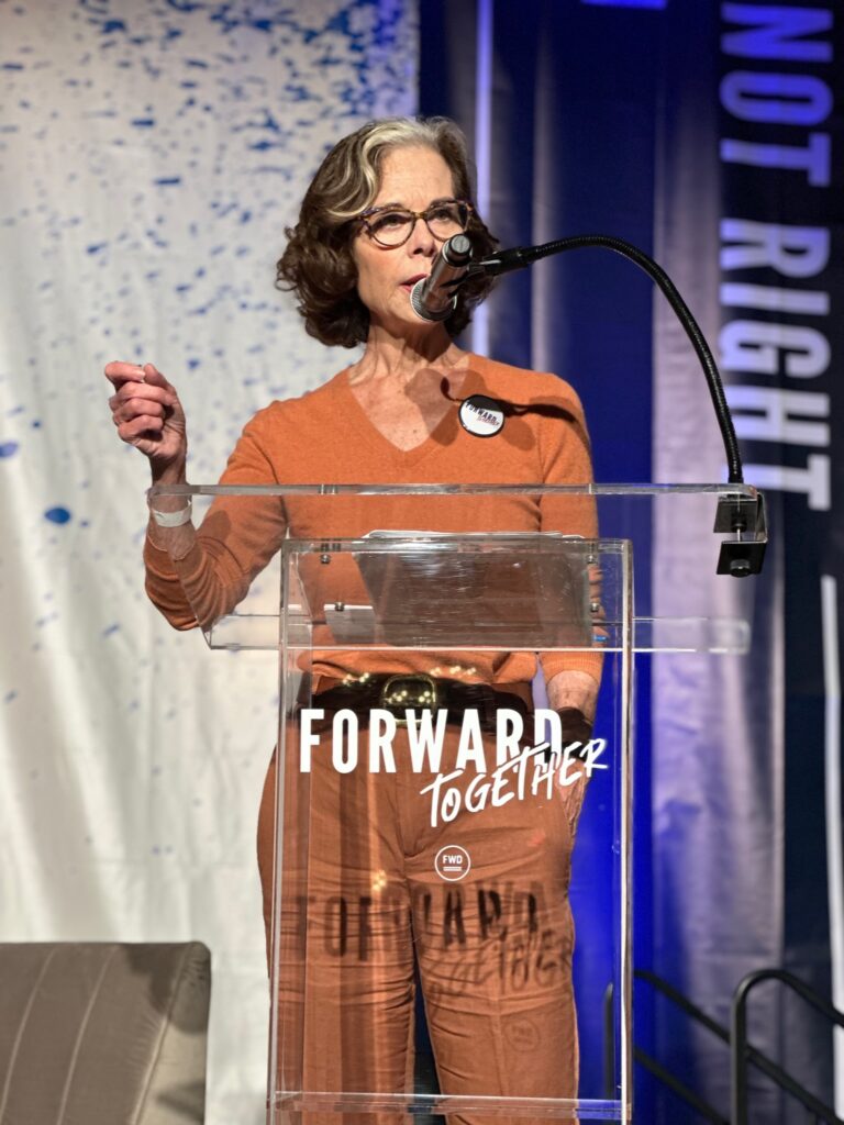
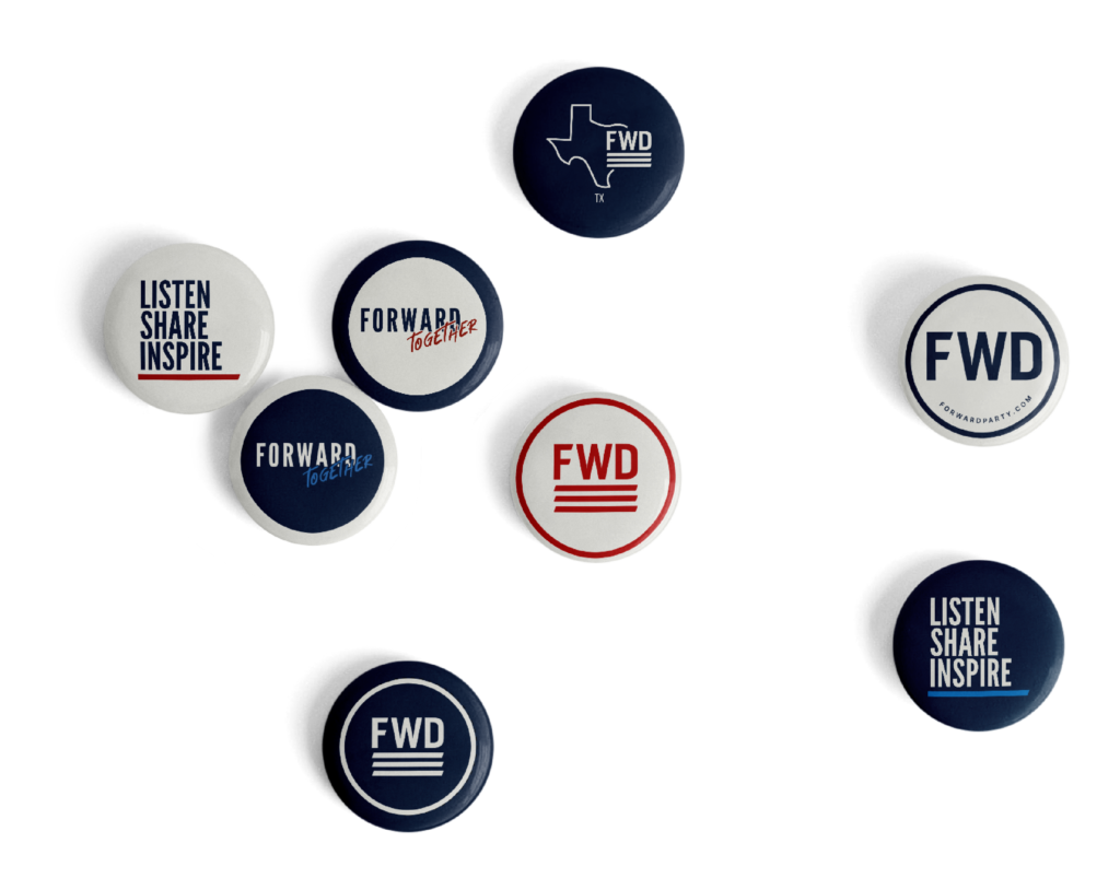
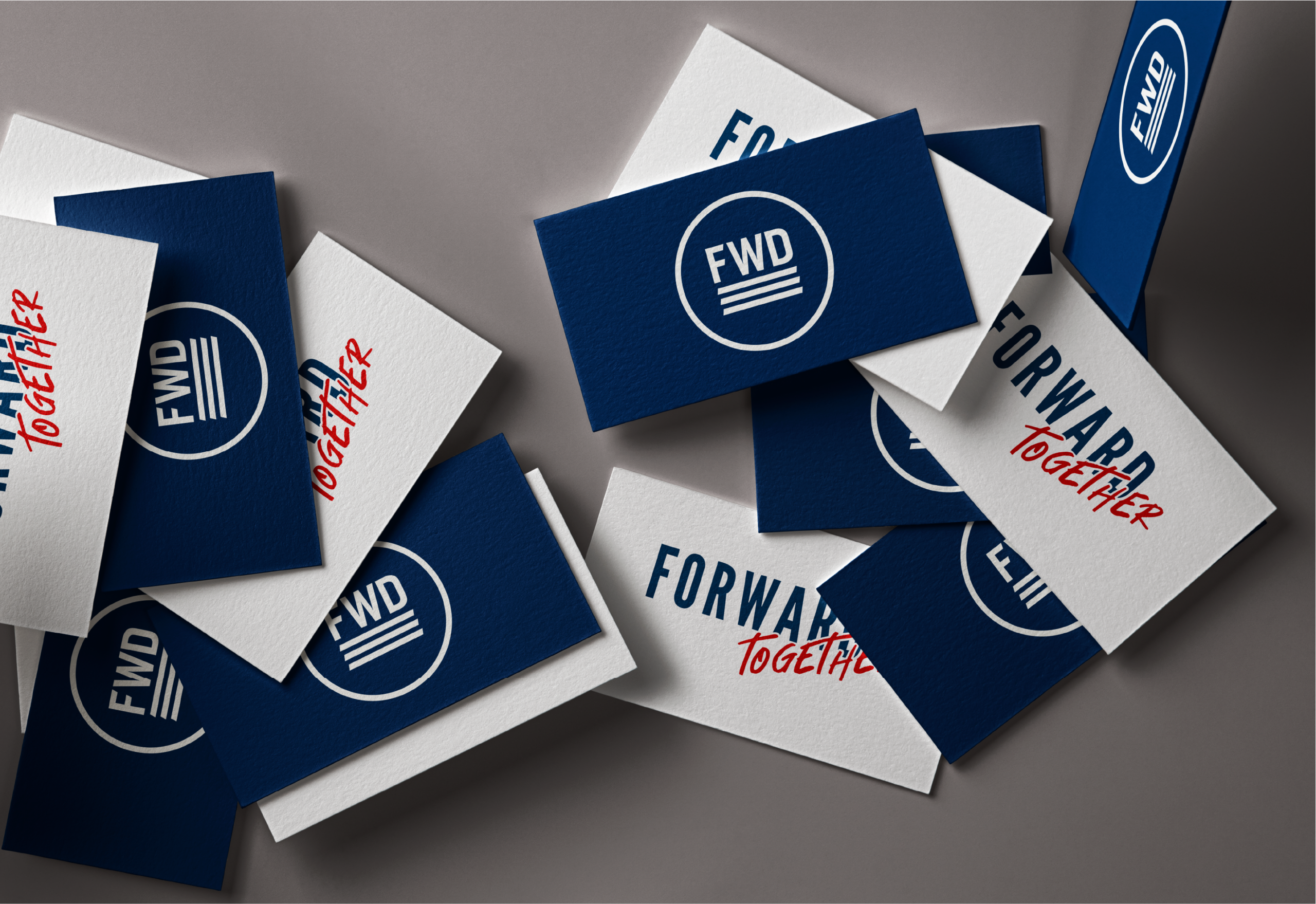
Forward Party
EXPAND
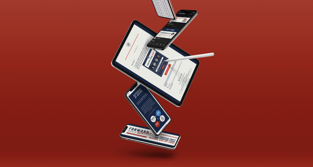
FORWARD PARTY
CONNECTED brands
ROLE
SERVICE
BRANDS BEFORE
A THREE-WAY MERGER
BRANDING PROCESS
DIFFICULTIES
PITCH DIRECTIONS AND FEEDBACK
OUTCOME
PROJECT DETAILS
RESULTS
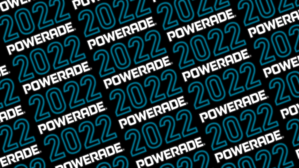
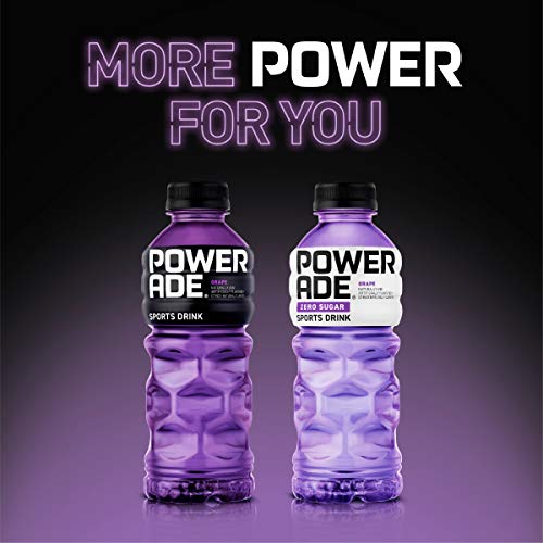
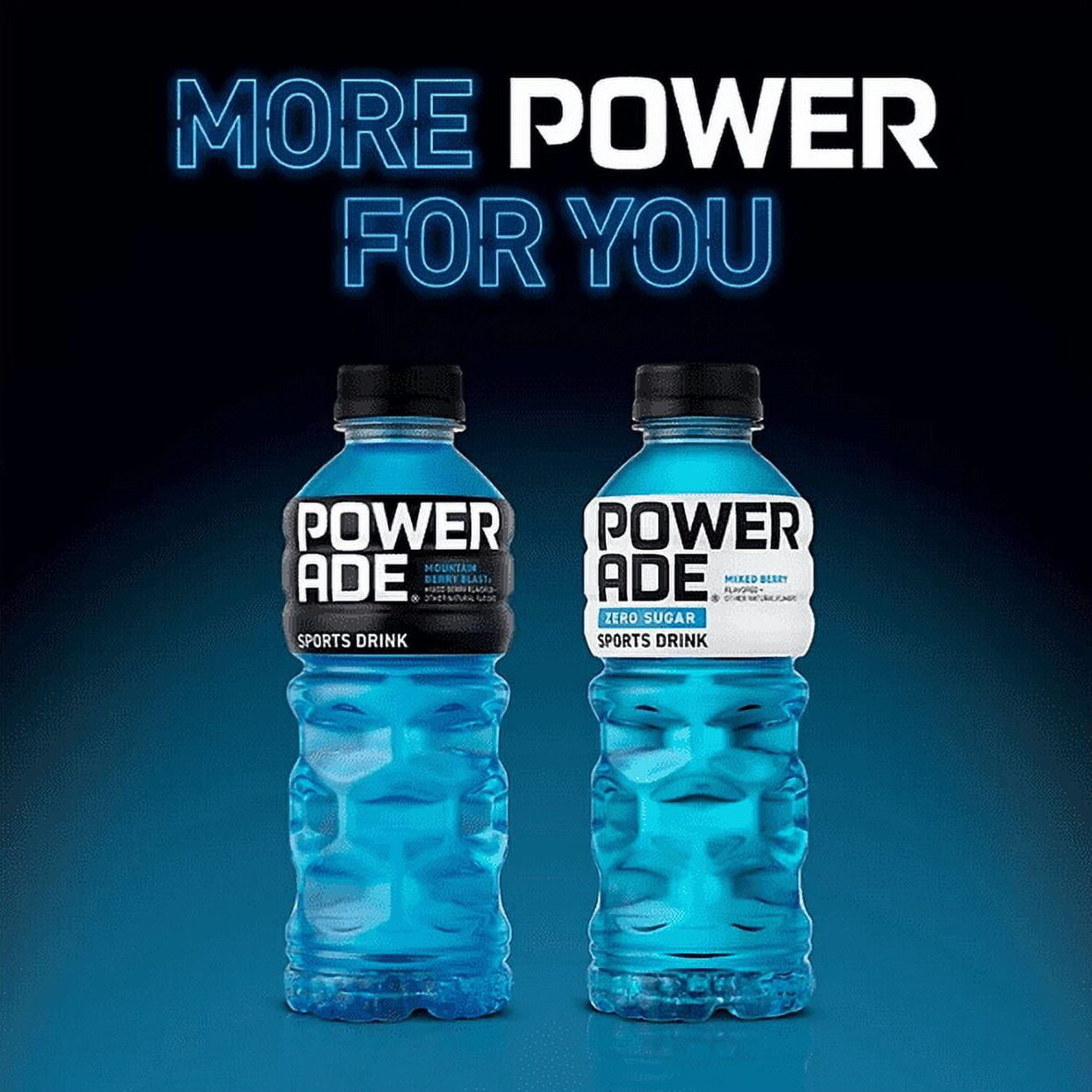
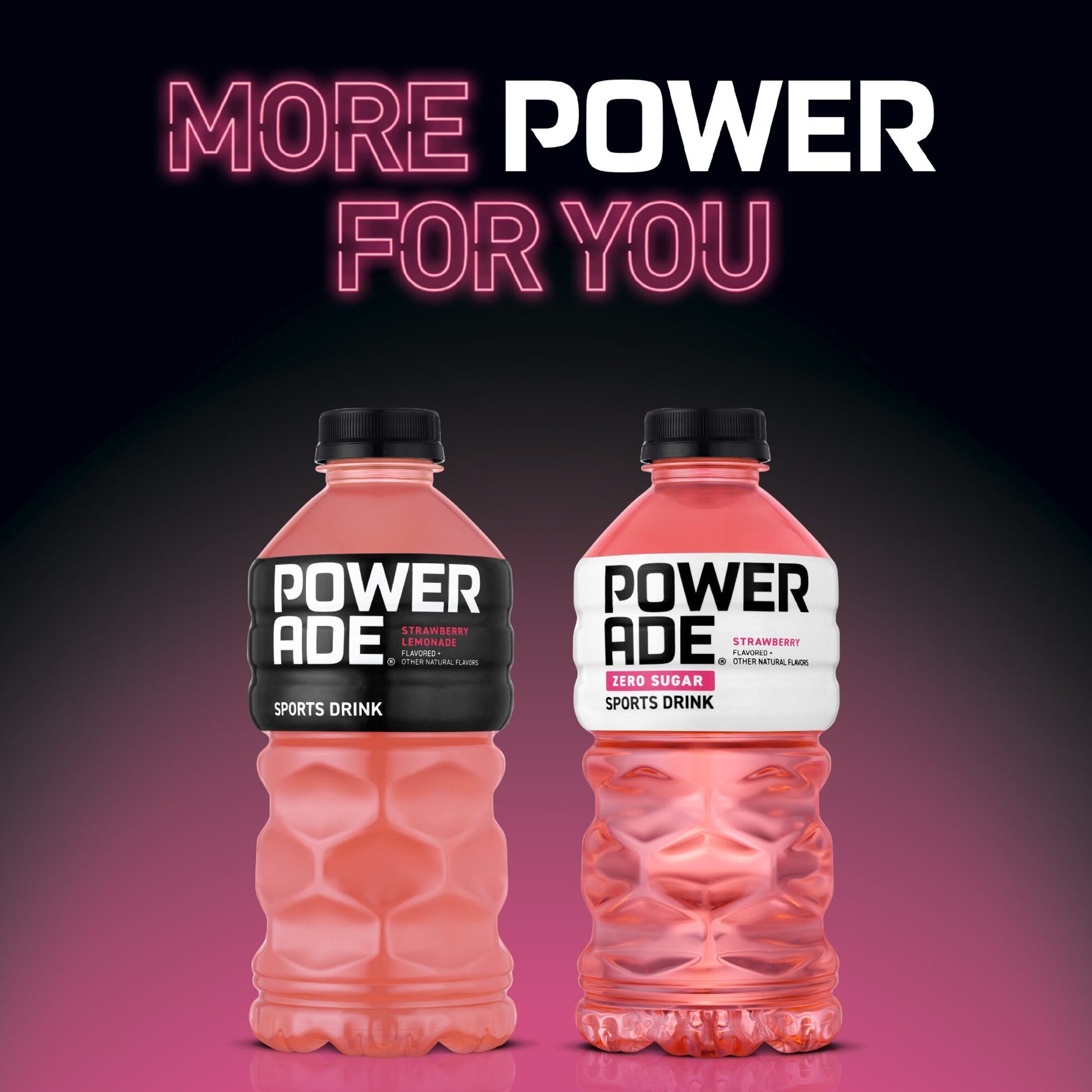
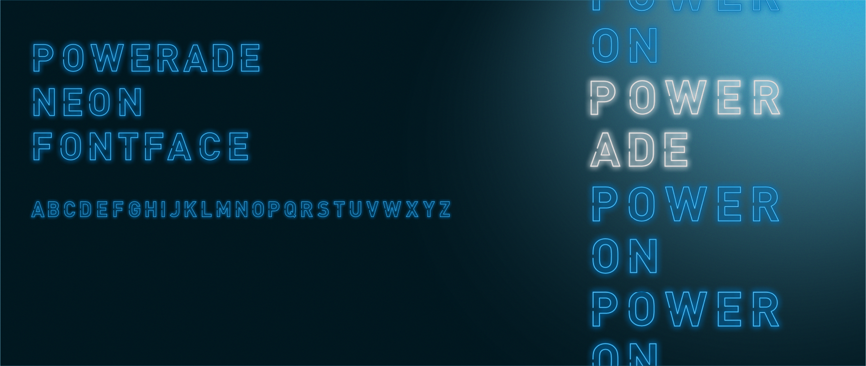
Powerade
EXPAND
MOST DESIGNS CONFIDENTAL
POWERADE
Client brands
agency
SERVICE
PROJECT DETAILS
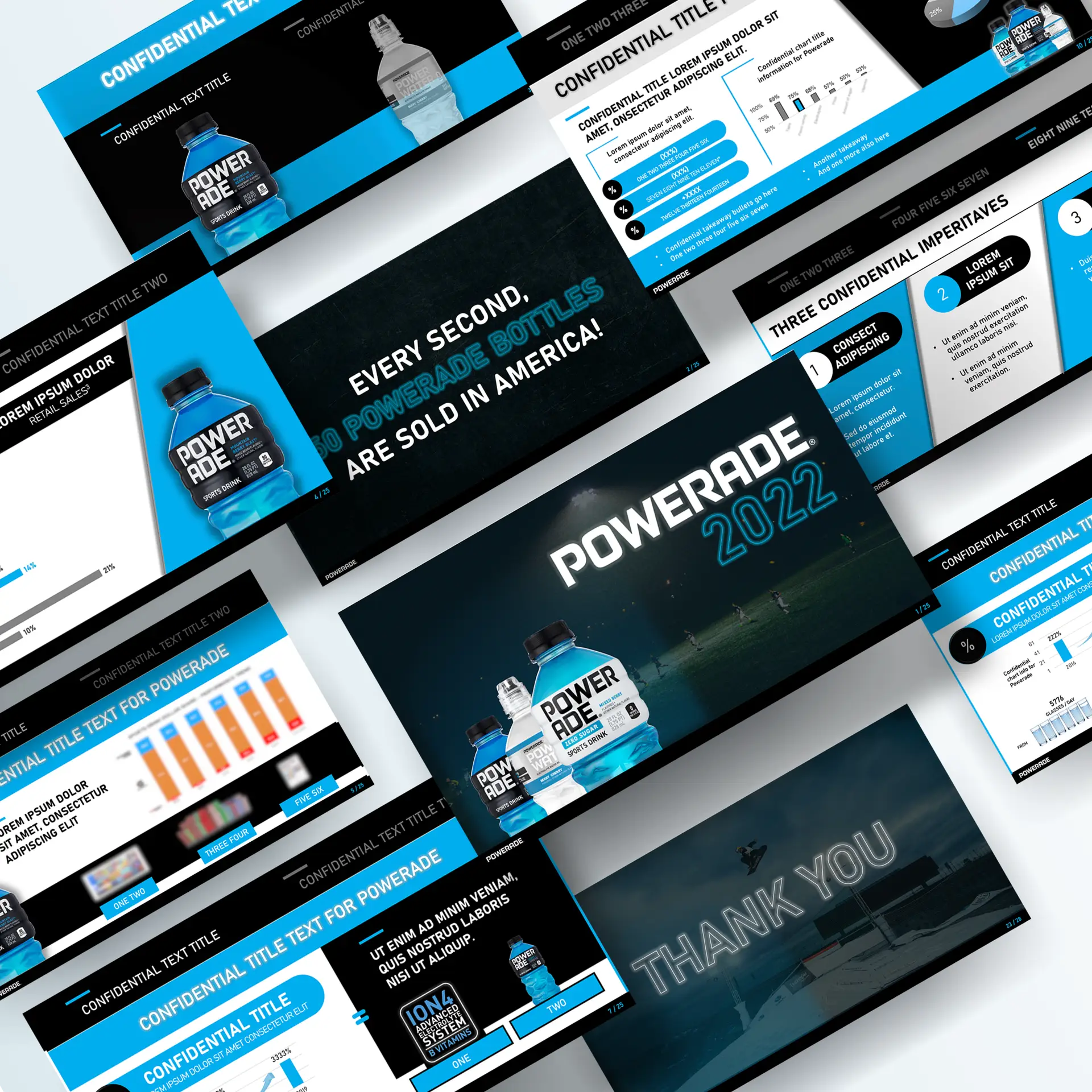
RESULTS
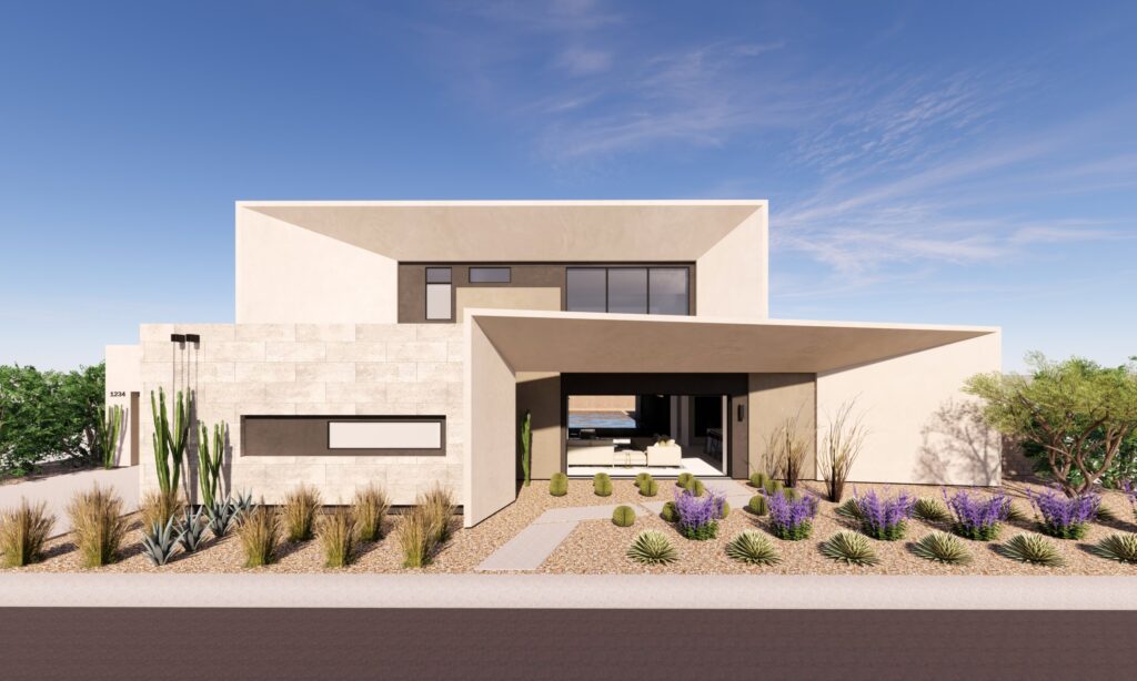
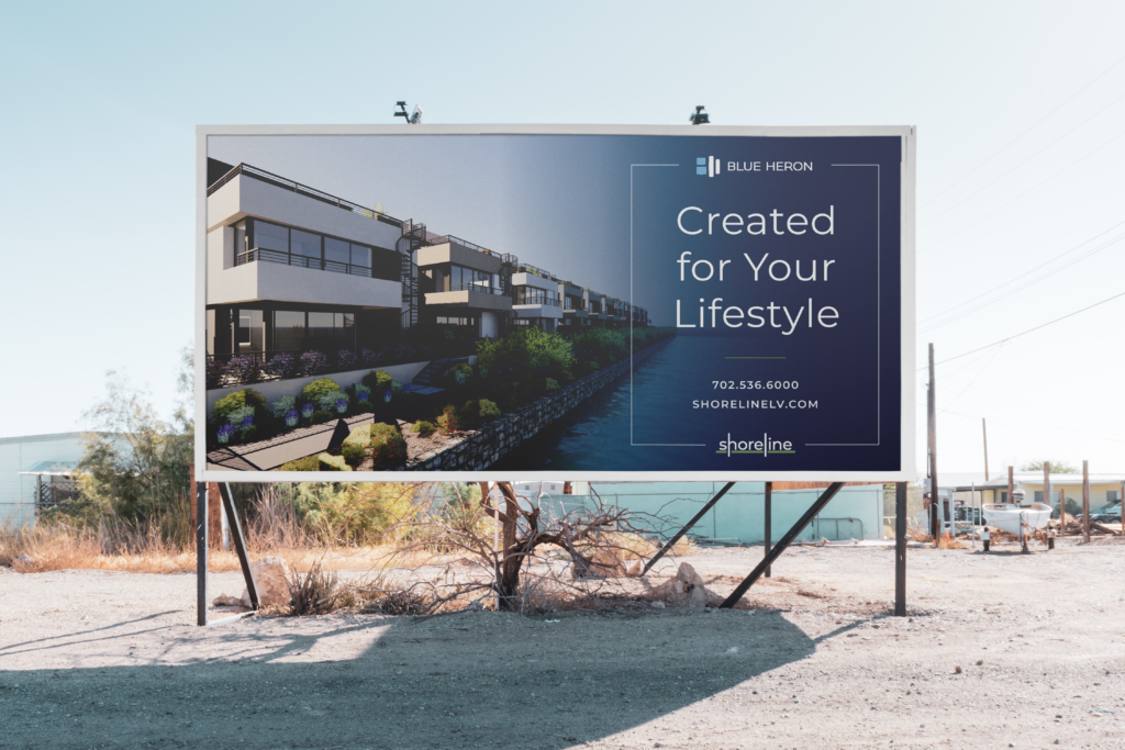
Blue Heron Homes
EXPAND
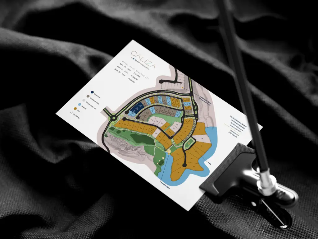
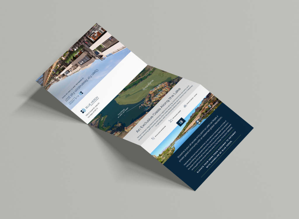
MOST DESIGNS CONFIDENTAL
Blue Heron Homes
Client brands
agency
SERVICE
BRANDING PROCESS
BRIEF
PITCH DIRECTIONS
FEEDBACK INTO FINALE
PROJECT DETAILS

RESULTS
So, let's chit-chat